
Maps aren’t something a lot of people use and understand anymore. Once upon a time, just the ability to use and fold a map was practically required for entry into adulthood.
Alas, it is now, a mostly lost art. Gone the way of cassette tapes, map knowledge is obsolete. Just trust Google to tell you when turn and what to do.
The problem today is that those who can create a map have immense power in the eyes of the public. Not that we bow down before such a person, but we do accept that any information presented in a map must be true. It’s a map. Maps don’t lie. Right?
Few seem to realize that maps, especially computerized maps, are created based on a specific information set. Change the information, and it changes the map.
For example, here’s the winter weather advisory map (all pink) along side the temperatures for that day:
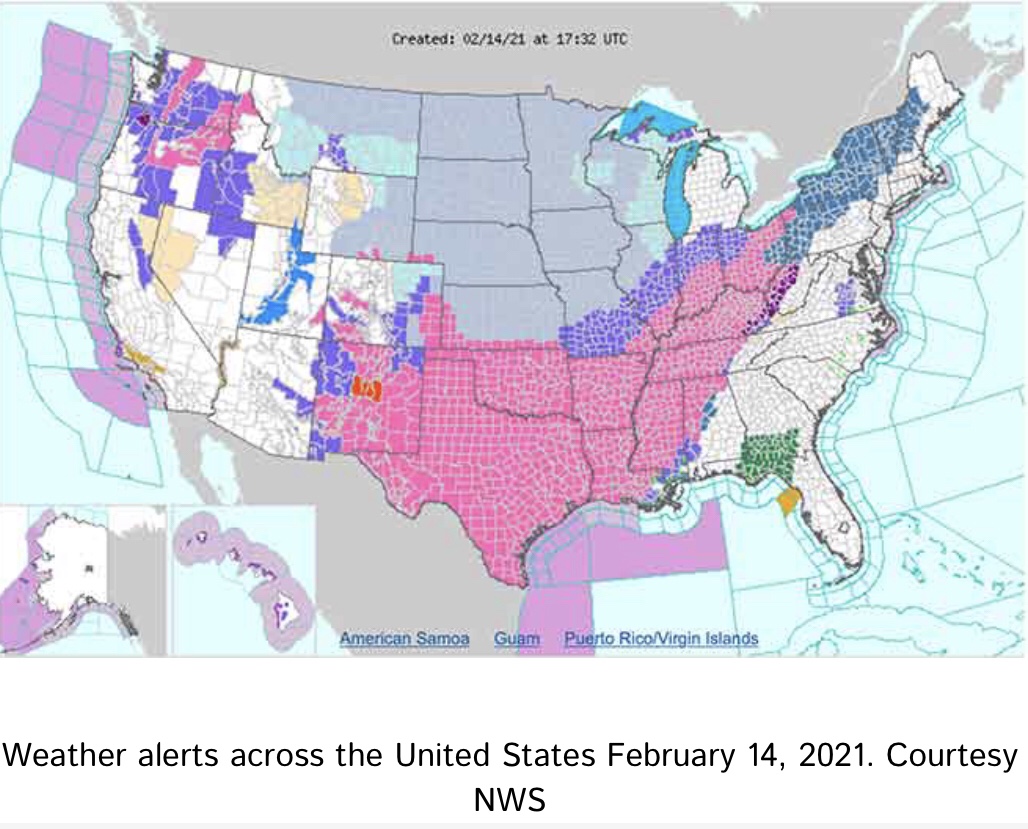
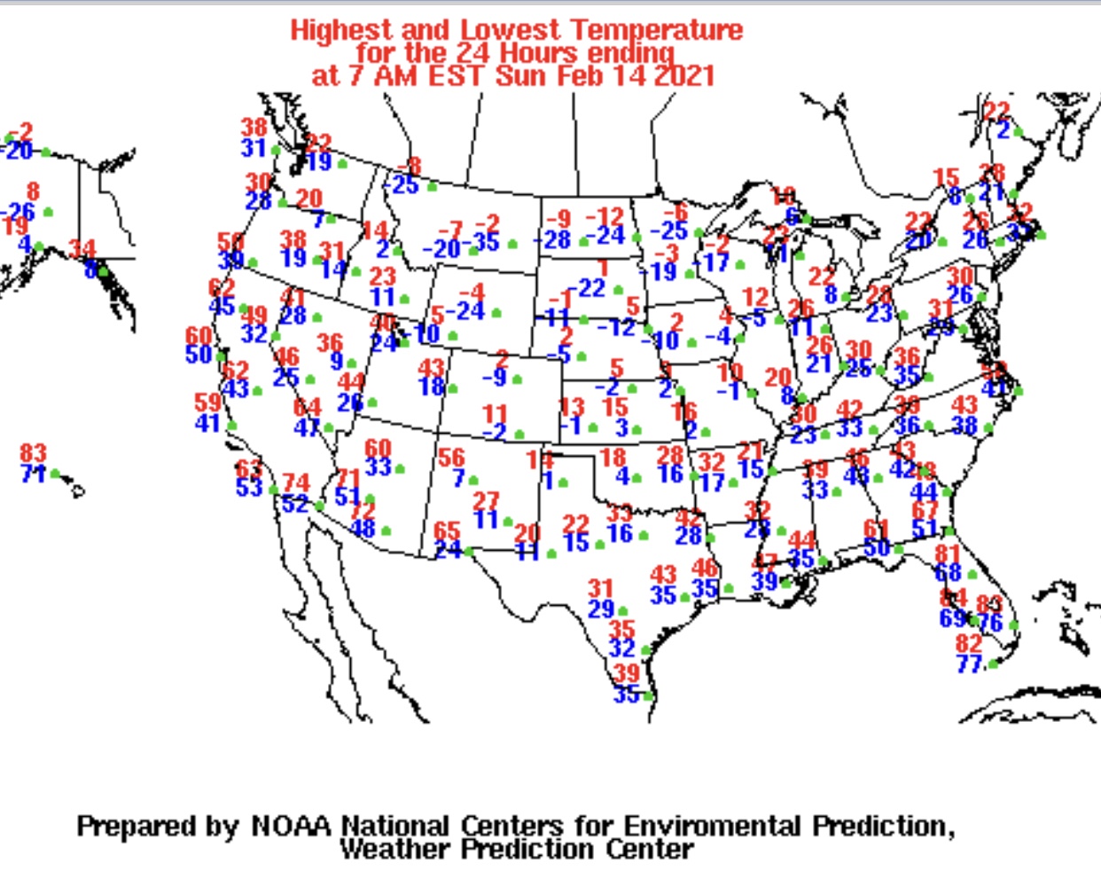
Weather alerts cover much of southern USA, but look at the temperatures map. Ask yourself why those northerners, with low temperatures down to -24 aren’t in a winter weather advisory. Then look at temperature records for Texas:
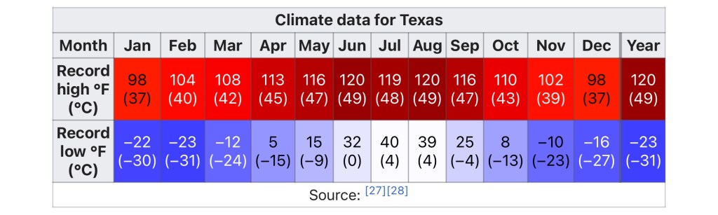
Notice that Texas didn’t even come close to breaking the record low temperature. Next, look at past weather for Texas. Why it was just 2004, the last time Texas got a lot of snow. Up to 14 inches fell and the storm lasted for 4 straight days.
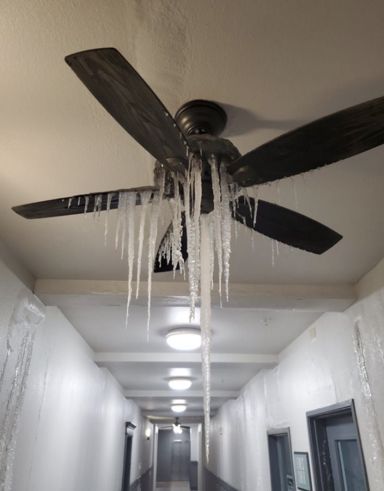
The recent February 2021 storm, as referenced in the pink covered map above, also lasted four days. So now you might say, “But there were power outages everywhere and people were freezing!” Yes, there were. However, it was not due to the weather. Texas and the surrounding states, have easily weathered weather like this many times before.
The hysteria we saw, is all very similar to that created by the scary maps of 2020. Remember those? How many of us sat at home, “flattening the curve” while watching the Covid outbreak maps on the TV? How many checked the internet to see if it was safe to go outside?
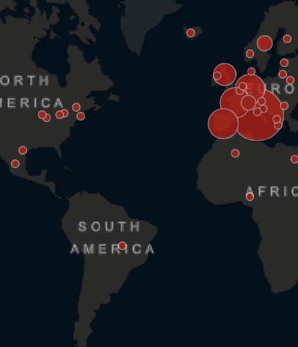
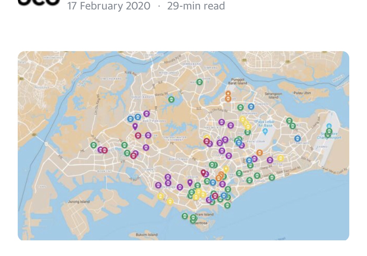
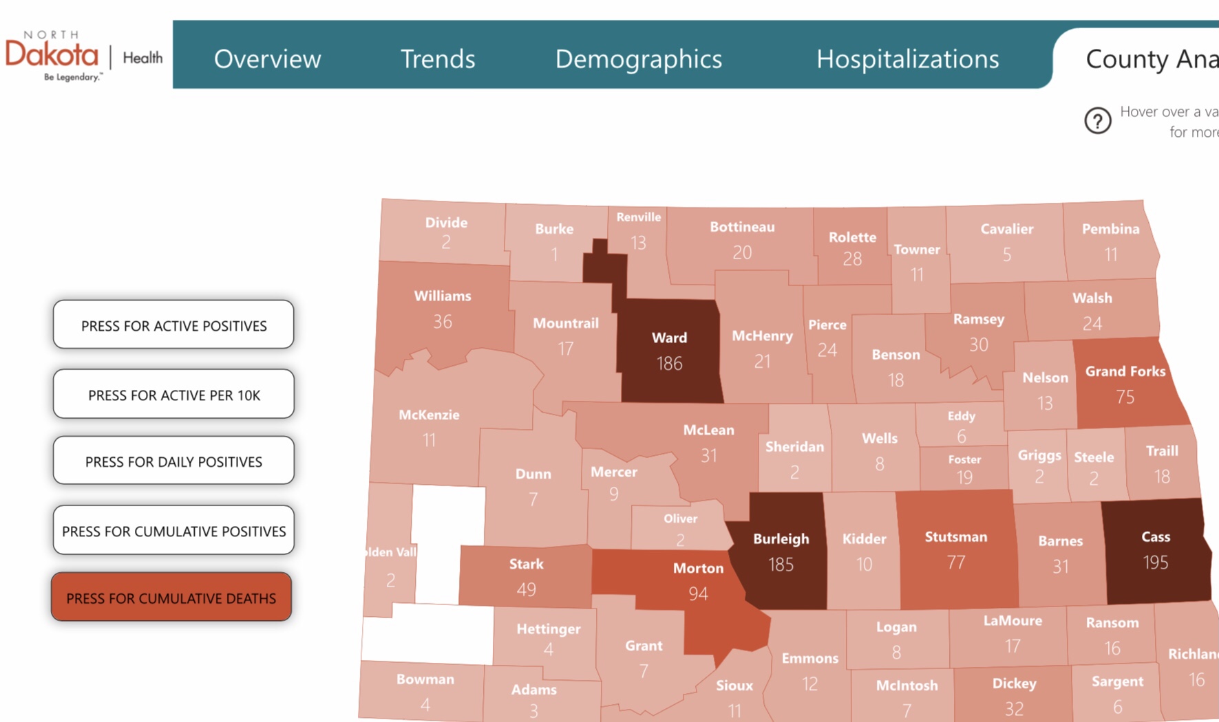
The power of the scary map is something that has been whole-heartedly embraced by many a local government official. North Dakota is one of many states that developed Covid Dashboards, rife with scary maps. (Which are all eerily similar, btw, for something supposedly developed locally by each individual state.)
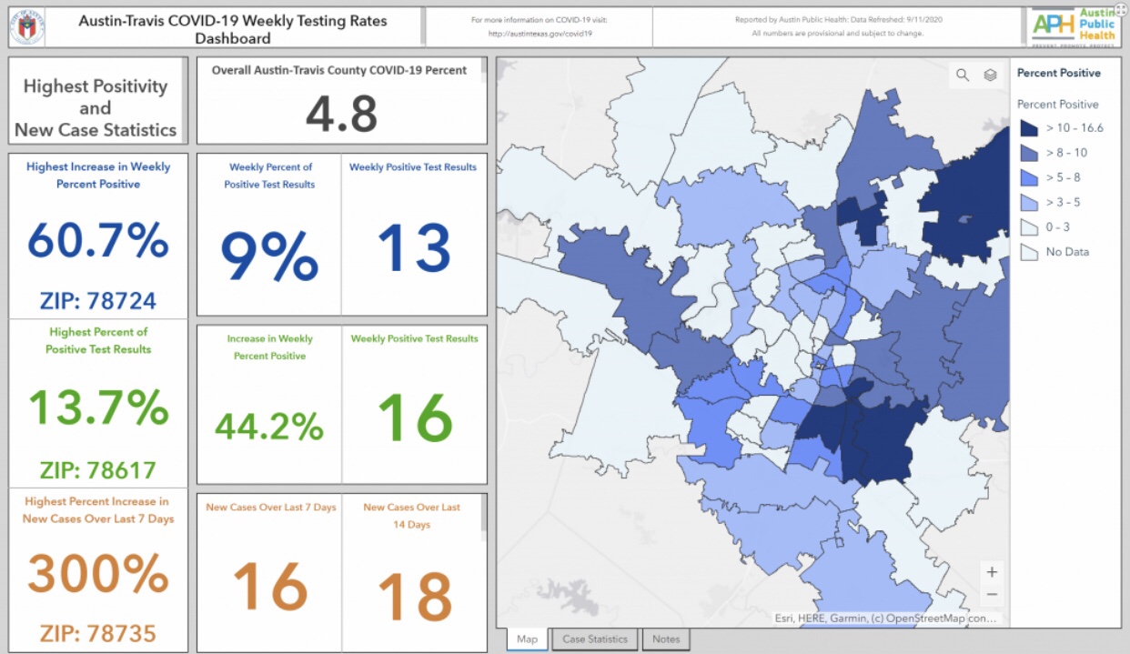
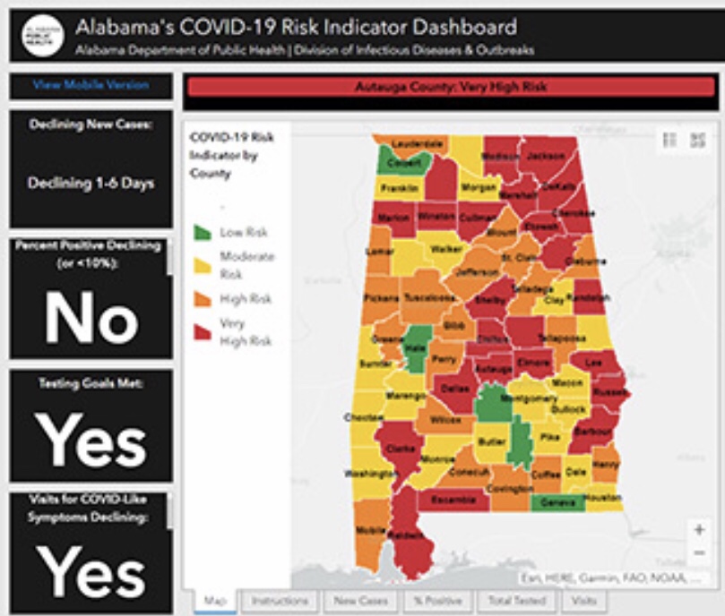


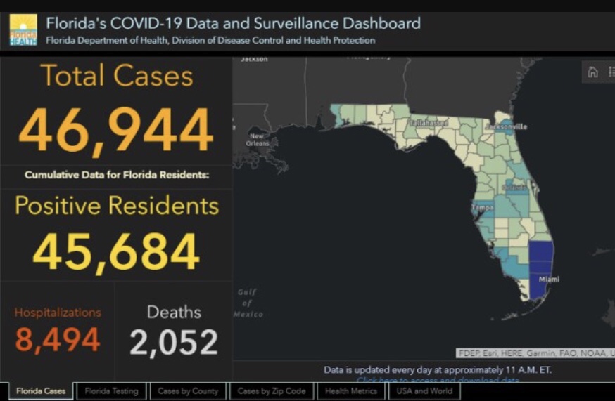
A wise person recently said, ‘wherever there is an abundance of repetition or an obvious pattern, you know the data is suspect. Nature is rarely, if ever, monotonous.’ The use of scary maps, especially manipulated scary maps is certainly becoming monotonous.
In the pattern, we can see that the truth is being obscured. We can see that the attempt to create fear doesn’t care for truth. Our elected officials seem to know of John 8:32, at least in concept.
And you shall know the truth, and the truth shall make you free.
Preferring personal power and wealth over freedom, individuals like Governor Doug Burgum, work to remove access to truth. For example, on October 23, 2020 Burgum instituted a policy of removing access to information, to “protect us from making decisions.”
Similarly, in Executive Order 13990, President Biden instituted requirements for energy production, “to protect us.” He did this by taking the recommendations from EPA report 85-FR-57398 and mandating them. In this instance, information about this is out there, but goodness gracious is it buried in bureaucratic legalese. In short, EO 13990 did a lot of things. Among them, it created new requirements for not maintaining a power supply backup, in case of emergency. Further, it required that power plant emissions be lowered, which is achieved by turning your power output down.
We can all see what happened. There was not enough energy to heat homes in the midst of a fairly typical, once every 10 to 15 years or so storm. As such, people were cold. Some died. Pipes burst and that resulted in a water shortage.
A perfect storm of bad things, all hidden behind a scary map. Given the multitude of scary maps promoted in the last 12 months, what other things were hidden behind a wall of hysteria due to these ‘informational’ graphics?
